Facebook
 Reddit
 Email
Email
The Android 16 QPR1 beta 1 is live with the new Material 3 Expressive UI. Here are all the major changes in this beta.
The first stable Android 16 version is expected to be released sometime in June 2025 but it won’t contain the new redesigned UI Google is calling Material 3 Expressive design. The new UI will arrive later this year with a second major update, and the beta testing has started already. The Android 16 QPR1 Beta 1 is live for all supported Pixel devices and brings several new features and changes.
In this article, we will go over some of the major new features and changes that the Android 16 QPR1 Beta 1 brings to the table.
What’s new in the Android 16 QPR1 Beta 1
The Android 16 QPR1 Beta 1 was released on May 20, 2025. After some careful observation, here are all the major changes in this beta build:
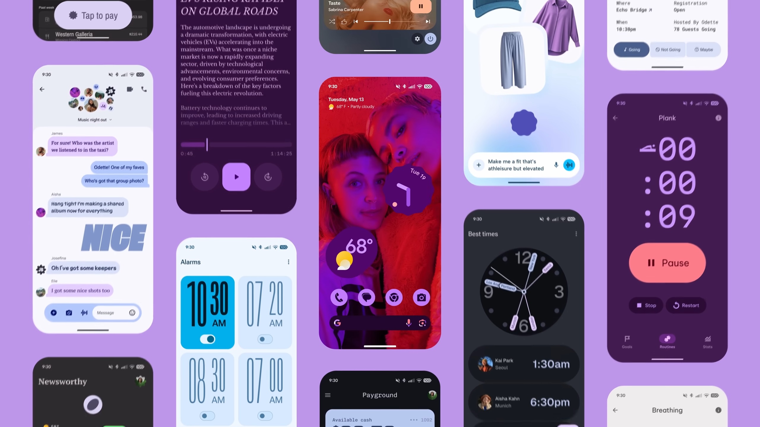
1) A Big UI Redesign With Material 3 Expressive Design
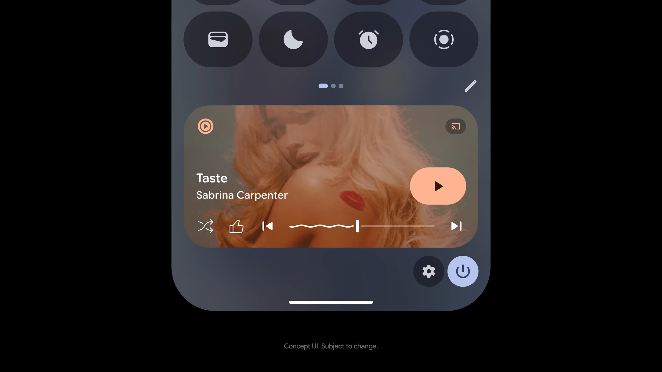
The first thing you will notice after installing QPR Beta 1 is the UI changes. Almost every aspect of the user interface has been redesigned with the new Material 3 Expressive theme that Google revealed at the I/O 2025 event. The QS shade, lockscreen, color tones, and more have been redesigned completely. It is something that you must experience yourself since words alone will not express it. We will discuss each of the changes in more detail below.
2) The Ultimate Wallpaper Customization Is Here
The wallpaper customization settings have received a huge update that will completely change how you apply wallpaper. You can now apply only a small portion of the wallpaper to your homescreen, while the rest of the area has a solid color. One can also add custom shapes between the actual wallpaper area and the solid background. You can add custom effects to the wallpaper, like rain, snow, fog, and more. You can also change the effect speed and a whole lot more.
3) Blur, Blur, and Some More Blur
Blur is a big part of the new UI. It seems Google has taken a page out of Apple’s yearbook and added a whole lot of blur to a whole lot of places. Pull down the notifications panel, there’s a blur. Pull up the recent menu, you will find a blur again. It has been added almost everywhere. You will see the moment you unlock the screen after the first boot.
4) Redefined Volume Controls Pop-out UI
The volume panel that pops out on the screen when you press any volume button is also redesigned. Gone are the bubbly bars that were way too round. The redesigned volume bars appear much better and look even cooler when you expand them.
5) Colorful Icons in the Settings App Are Back
With the release of Android 9 Pie back in the day, Google introduced some really colorful icons in the settings app that really brightened things in the otherwise dull-looking settings categories. However, Google removed it in Android 10 for some reason and went back to the monotonous design. However, in a surprising move, Google has brought them back, and they look better than ever.
6) Resizable QS Tiles
Android 12 redesigned the Quick Settings (QS) menu and made each item into pill-shaped titles, which simply looked bad and took up too much space. However, Google’s new redesign allows you to choose between multiple shapes for the QS tiles, so almost everyone can be happy this time. You can turn them into pills or rounded little square titles.
7) Function Pill in the Recents Menu
Pulling up the recent menu will reveal all the changes they made. For one, there’s a definite background blur that we discussed previously. Secondly, Google added a small pill at the top-left corner of every background app, which will display essential functions, such as App info, Split screen, Screenshot, and more when pressed.
8) Resizable Lockscreen Clock
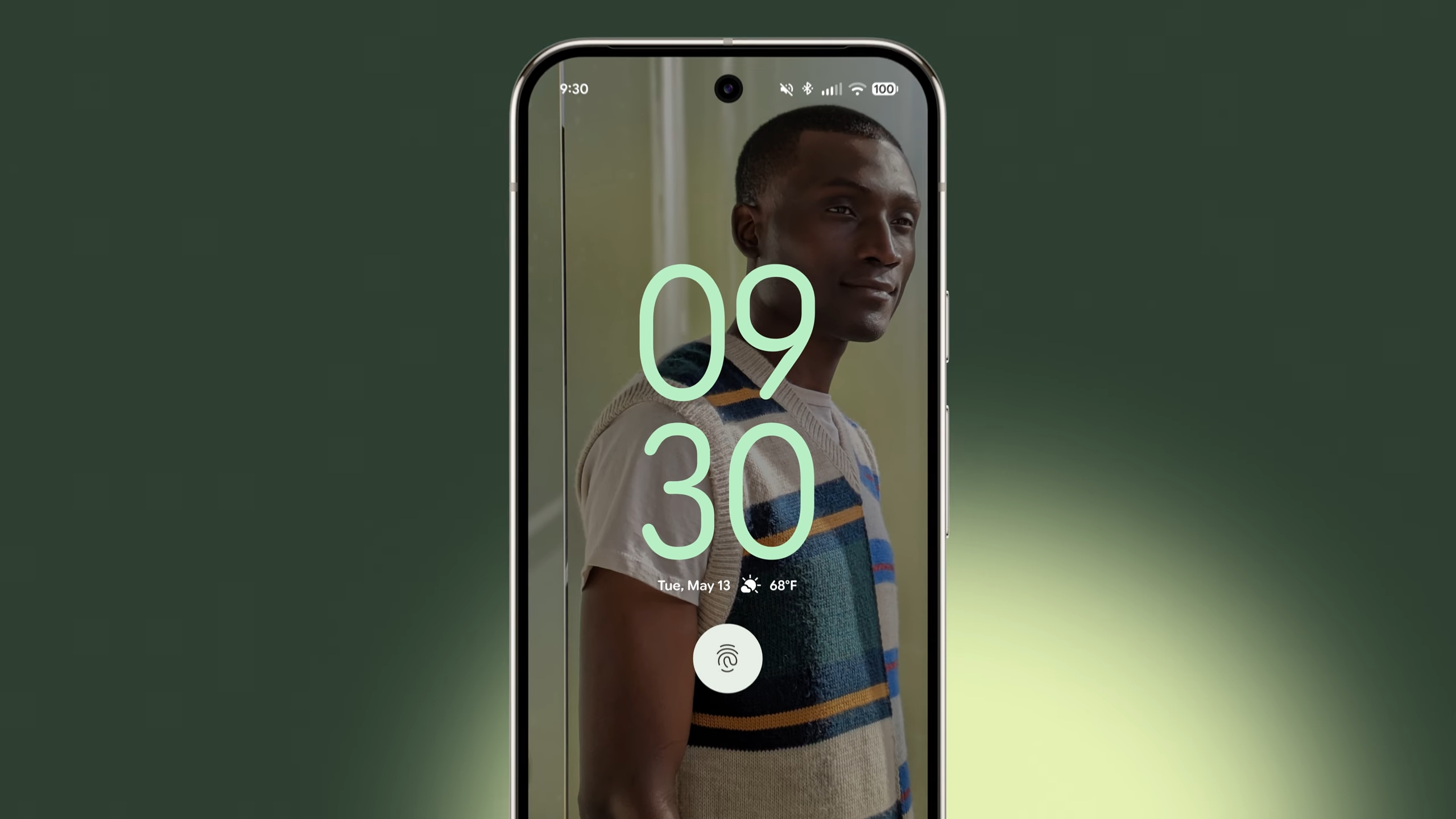
Do you find the clock in the lock screen of Android 16 too big for your liking? Well, you will soon be able to resize it when the second update of Android 16 goes live. If you are impatient, you can try it now by installing the Android 16 QPR1 Beta 1.
Final Thoughts
While we only talked about the major changes in the Android 16 QPR1 Beta 1 release, there are countless more changes. They may not be as big as the ones listed above, but they can still add a meaningful experience. Stay tuned for more showcases of Android 16 QPR1 Beta 1 features.
We provide the latest news and “How To’s” for Tech content. Meanwhile, you can check out the following articles related to PC GPUs, CPU and GPU comparisons, mobile phones, and more:
- 5 Best Air Coolers for CPUs in 2025
- ASUS TUF Gaming F16 Release Date, Specifications, Price, and More
- iPhone 16e vs iPhone SE (3rd Gen): Which One To Buy in 2025?
- Powerbeats Pro 2 vs AirPods Pro 2: Which One To Get in 2025
- RTX 5070 Ti vs. RTX 4070 Super: Specs, Price and More Compared
- Windows 11: How To Disable Lock Screen Widgets