Facebook
 Reddit
 Email
Email
Google is bringing the Material 3 Expressive design to the Google Messages app to align it with the rest of Android 16’s user interface.
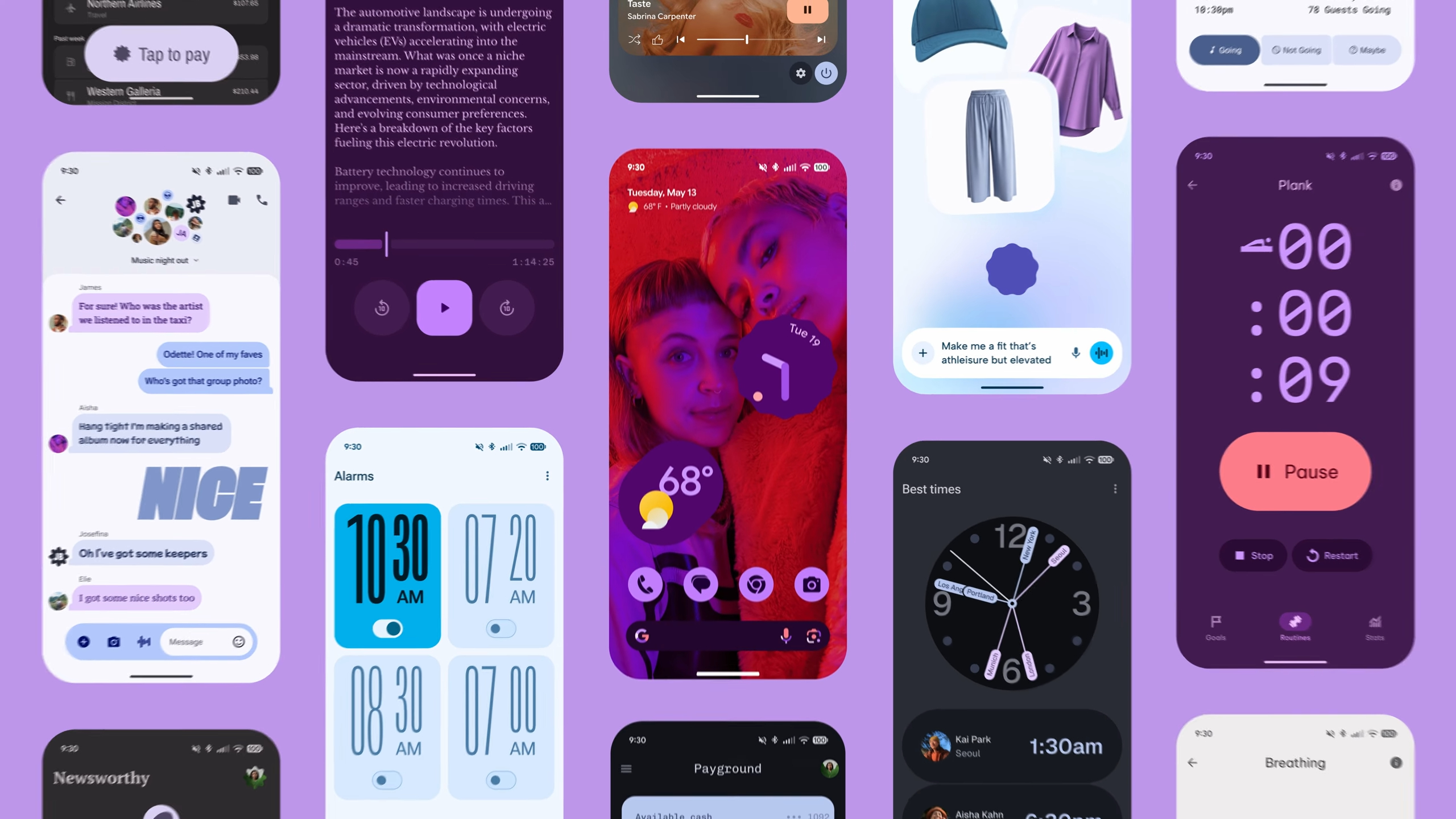
Google revealed the Material 3 Expressive design language for the Android 16 update at the Google I/O 2025 event. While Android 16 with this design hasn’t arrived yet, the new design has appeared on some apps, like the Google Messages app, in beta versions. This allows users to get the first taste of how the new Material 3 Expressive design looks in the Messages app.
In this article, we will discuss some of these design changes and new additions that are coming to the Google Messages app.
Note: The article is subjective and reflects the writer’s opinion.
Google Messages App With Material 3 Expressive Redesign
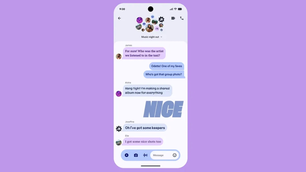
The Material 3 Expressive design in the Google Messages app was first discovered by a Reddit user, v3n0msn4k3. Apparently, this person installed the beta version of the Messages app on their Galaxy Z Fold6. Other Samsung owners also commented on the post and confirmed they received the new UI. Apparently, the new UI is only available on the Samsung version of the beta Google Messages app, as we didn’t see the new user interface when we tried the beta version.
For those unaware, Samsung Galaxy phones feature a special version of the Google Messages app that is different from the standard app. Samsung could be collaborating with Samsung for the new design, which would explain why the new Material 3 Expressive design is only found in Samsung phones.
List of Changes in the New Google Messages Beta Version
Nonetheless, here are all the new changes in the Google Messages Beta app:
- When you tap on the search button, the predefined cards, such as Unread, Known, Starred, Images, and more, have seen a new design layout. Instead of the usual 2×4 layout, the new beta version has a 4×2 layout with dual color tones.
- When you search for a person, they appear in the search results like actual conversations.
- The new theme with a wide Gemini banner appears when you click on the “New Messages” button.
- The gallery and camera attachment button in the text message field are also redesigned with the new Material 3 design.
This concludes the list of all the changes in the Google Messages app. There will be more updates and changes in the future to ensure the new UI matures properly during the beta testing phase and may even arrive on non-Samsung phones later.
We provide the latest news and “How To’s” for Tech content. Meanwhile, you can check out the following articles related to PC GPUs, CPU and GPU comparisons, mobile phones, and more:
- 5 Best Air Coolers for CPUs in 2025
- ASUS TUF Gaming F16 Release Date, Specifications, Price, and More
- iPhone 16e vs iPhone SE (3rd Gen): Which One To Buy in 2025?
- Powerbeats Pro 2 vs AirPods Pro 2: Which One To Get in 2025
- RTX 5070 Ti vs. RTX 4070 Super: Specs, Price and More Compared
- Windows 11: How To Disable Lock Screen Widgets