Facebook
 Reddit
 Email
Email
Google apps receive a Material 3 Expressive redesign; updates include floating toolbars, rounded layouts, and refined animations.
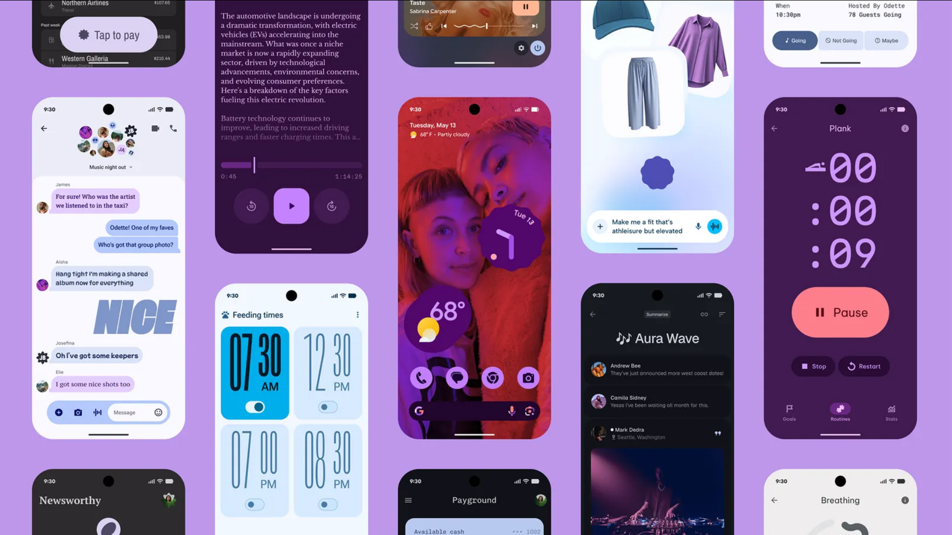
Google is gradually updating the way its popular apps look by applying the Material 3 Expressive design language. With this update, which is inspired by Material You, some small but visible improvements help make the interface look cleaner and more organized.
These redesigns are currently implemented on the Google apps, like Google Photos, Gmail, and Google Messages. However, with time, we expect other apps to follow a similar trend. In this post, we will share what these design updates are on the Google apps and how they will affect the users. Let’s get into it.
Background on Material 3 Expressive
At Google’s “Android Show: I/O Edition,” Material 3 Expressive was introduced. It is now seen as the next step forward in Android and Google’s app design. The concept behind the design is to use color themes that change over time, responsive animations, new typography, and refined UI parts to provide everyone with a personal but standard experience. The updates are meant to make the platform more attractive and also to make it easier to use and interact with on any device.
Detailed Updates in Key Google Apps
Google Photos
A major example of this change is seen in Google Photos. After the update, the toolbar now holds the Share, Add Photos, and Edit buttons. Earlier, these options were found below the album cover. However, now they are placed in a floating toolbar, making everything easier to see and arrange.
Moreover, a new “Show QR Code” button has been added. This button allows users to share albums by producing a QR code. This QR code can be scanned to access or add elements to the album. These changes make using the app simpler, but they do not affect its main features.
Gmail
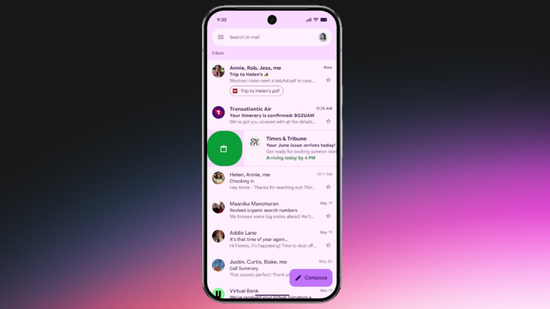
Gmail is now updating its design to follow the new Material 3 Expressive guidelines. People are noticing that their message lists are displayed as rounded-corner cards, which adds a smoother appearance. The search bar, menu, and account switcher are now placed apart from the main content. This change makes it easier to separate their functions.
Additionally, the ‘Compose’ button to craft a new mail stands out more. Furthermore, the animation of swiping to archive a conversation has been improved. They keep the app working exactly the same, but give it a more contemporary look.
Google Messages
Updates are also added to Google Messages, with the redesign changing how conversation threads are displayed and what actions are available to users. Threads are now placed in containers with rounded corners. This change helps clearly separate the content from the app’s header.
The Plus menu has been changed so that Gallery, GIFs, and Stickers are shown in pill-shaped containers instead of the former round icons. Also, the emoji keyboard has a unified button bar. This button bar allows users to choose between Emoji, GIFs, Stickers, and Photomoji seamlessly. The new design makes the app look modern but still keeps its main simplicity.
We provide the latest news and “How To’s” for Tech content. Meanwhile, you can check out the following articles related to PC GPUs, CPU and GPU comparisons, mobile phones, and more:
- 5 Best Air Coolers for CPUs in 2025
- ASUS TUF Gaming F16 Release Date, Specifications, Price, and More
- iPhone 16e vs iPhone SE (3rd Gen): Which One To Buy in 2025?
- Powerbeats Pro 2 vs AirPods Pro 2: Which One To Get in 2025
- RTX 5070 Ti vs. RTX 4070 Super: Specs, Price and More Compared
- Windows 11: How To Disable Lock Screen Widgets