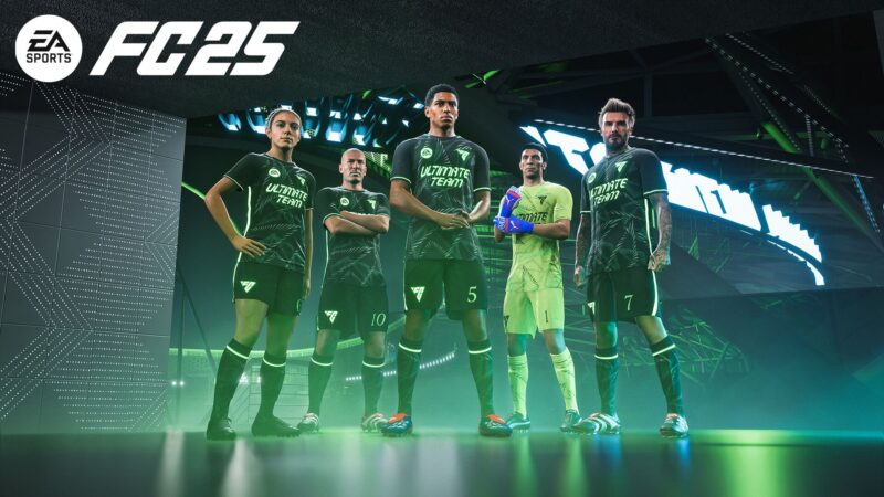
EAFC 25 has some stylish kits for the 2024-25 season and we’ve listed the best ones available. Check out these cool jerseys!

The best kits in EAFC 25 are those that most fans would agree are aesthetically pleasing. While your jersey won’t help you win matches, everyone loves wearing a cool kit to show off. Some jerseys are truly stunning to look at, while others can look a bit awkward or even bland.
Most players love to see their favorite clubs donning stylish outfits. Some may even choose their Career Mode team based on how cool the jerseys are. Nevertheless, we’ve got a list of the most stylish jerseys you can find in EAFC 25 for the 2024-25 season down below. This includes kits from famous clubs, and even the jersey of a national team.
Note: The article is subjective.
10 Best Looking Kits in EAFC 25
1) Chelsea Home

Chelsea went for a subtle, almost psychedelic design, using the backdrop of a stunning shade of blue. Fans of The Blues will undoubtedly remember this season for their fashionable uniform. The swirls are not too distracting and add a touch of originality. It almost seems to resemble the calmness of the ocean.
2) Venezia Away

Venezia have frequently grabbed headlines for their stunning jerseys, which easily outclass most other Serie A clubs. This year, they showed off some unique kits that have no branding at all, apart from their club logo. If you’re a fan of minimalism, you can’t get any more minimalist than this.
The home kit is all-black whereas the away one is all-white. This clean, refined look often appears almost too classy for football.
3) Juventus Alternate

The alternate kit for Juventus this season seems to be in the same vein as the Venezia kits. It’s in a shade of blue so subtle that it almost appears gray. In fact, it looks even better in real-life than it does in-game. EA seems to have missed the silvery patterns on the jersey.
Nevertheless, if you want a minimalist-looking jersey that has just the right amount of branding in the right places, you’ll love the Juventus alternate kit.
4) Barcelona Home

Whether you like or dislike Barcelona, you can’t deny that their latest kit looks absolutely stunning. Whenever they bring back the two tone design, it looks way more attractive than the striped variants. The Spotify logo only serves to compliment the design, as it’s just a simple circle in the center. There are no distracting texts, and the club logo has also been shifted to the center to match the aesthetic.
Overall, Barcelona’s home jersey is undeniably one of the best kits in EAFC 25 right now.
5) Augsburg Alternate
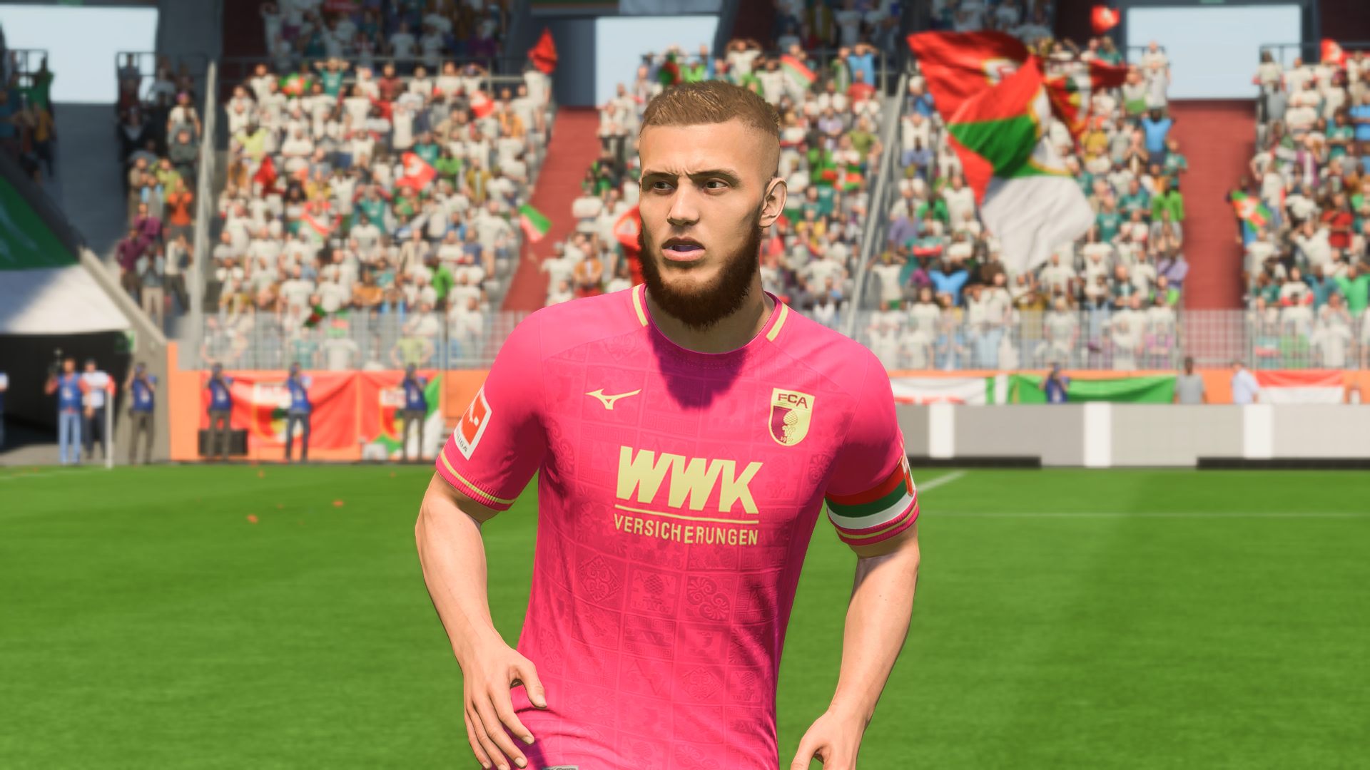
Augsburg’s alternate kit is a beautiful shade of burgundy, and the gold trims and text accentuate it well. Check it out in-game as its appearance tends to vary depending on the lighting.
It’s called the Roman kit in honor of Augsburg’s Roman connection, and you might even find some similarities with AS Roma’s home kit mentioned down below.
6) Arsenal Alternate

Arsenal’s alternate kit for this year features some subtle shades of blue, with some mauve undertones. The dark blue borders, complete with the typical Adidas stripe on the shoulders, provide a much-need contrast. This is definitely one of the most stylish EPL kits in EAFC 25.
7) Roma Home
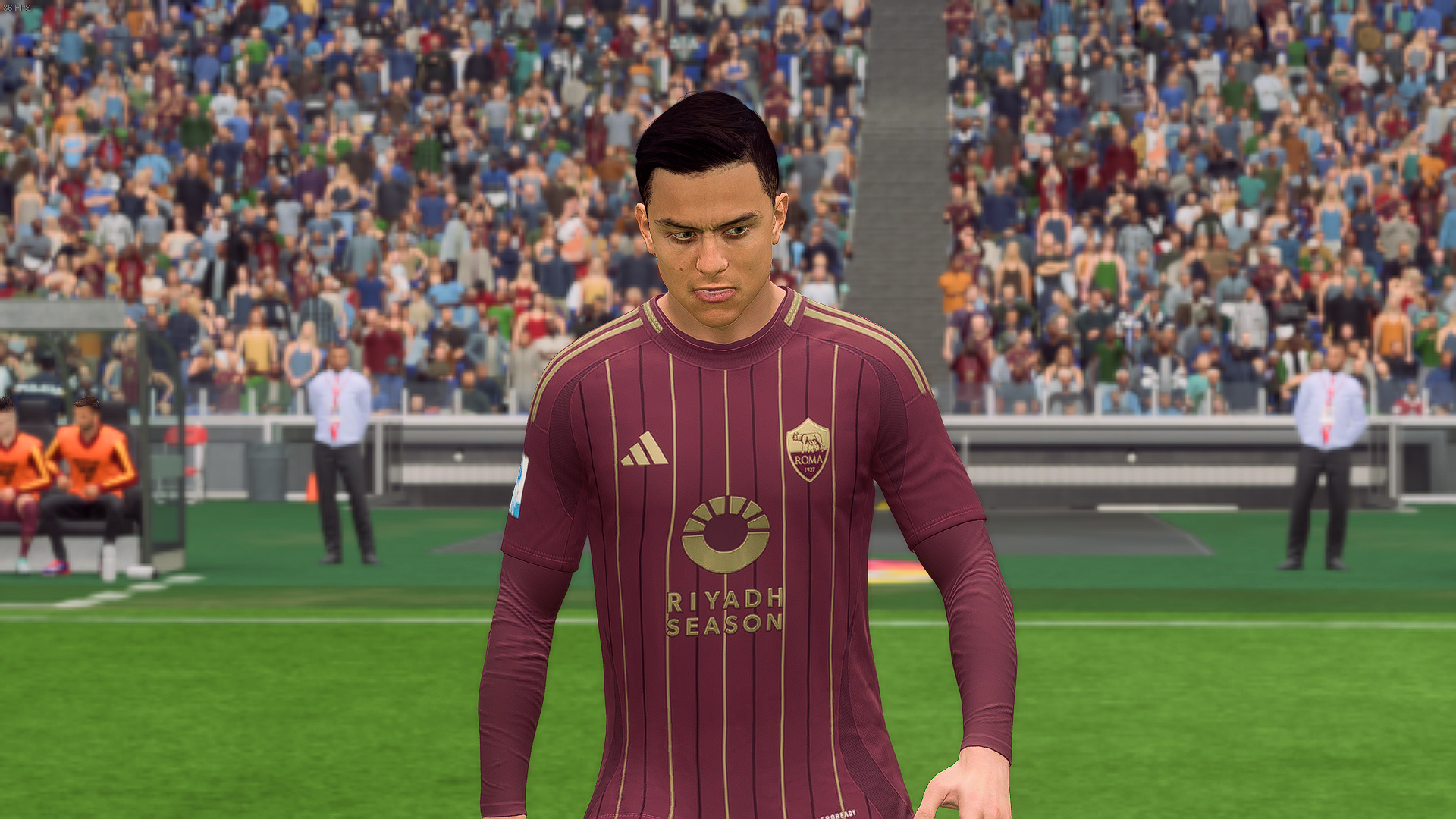
The Roma home kit looks a lot similar to the Augsburg “Roman” alternate kit. Despite what you may see in the screenshots, the colors are actually quite similar. Roma has some classic stripes running all along the jersey, and this makes the kit look like a blend of the old and modern. Just like the Augsburg kit, the text and logos are all golden.
8) Lombardia FC Away (Inter Milan)

Lombardia FC is EAFC 25’s name for Inter Milan, since EA Sports couldn’t get the license for the club. While the home kit for these Italian giants look a bit awkward, the away kit is absolutely phenomenal. Inter Milan has a history of featuring snakes on their away kits, and this unique jersey designed by EA pays homage to it.
In fact, even the “not Inter Milan” logo features a snake on it, so it seems to be a recurring theme.
9) Netherlands Home

There’s something appealing about the Oranje’s orange kits, and this year’s jersey seems to be a drastic step towards a more classic design. The jersey almost feels out of time, only with a slight hint of its modern creation. The subtle stripes are barely there unless you’re looking closely, but it prevents the bright color from being too distracting.
10) Minnesota United Home

If you’re looking for a jersey which could pass off as a cool painting, you might like the home kit of Minnesota United. The MLS club has one of the most distinct jerseys this year. It’s a black jersey being complemented with light blue specks in between, as if you were looking at a galaxy or a nebula. It seems to match the club logo almost seamlessly.
Looking For More?
Thank you for reading the Article. We provide the latest news and create guides for Baldur’s Gate 3, Starfield, ARK Survival Ascended, and more. Also, watch Deltia play games on Twitch or visit his YouTube channel!
 Reddit
 Email
Email
