Facebook
 Reddit
 Email
Email
Google is working on a redesigned Play Store to make its featured apps and games more attractive to users and help increase their downloads.
Google first showed interest in a Play Store redesign back in 2024 when it delivered a new collection widget to showcase movies, music, TV shows, and more. Clicking on the widget would take you to the Collections section of the Play Store. Since then, the search giant has been hard at work in the background to redesign the Play Store UI in a bid to help developers make their apps and games more attractive to users.
After a whole year, Google finally showcased the new Play Store UI redesign on the last day of the I/O 2025 event. In this article, I will analyze the new Play Store UI and explain everything you need to know.
Note: Some aspects of this article are subjective and reflect the writer’s opinions.
Google Showcased a New Play Store UI at the I/O 2025 Event
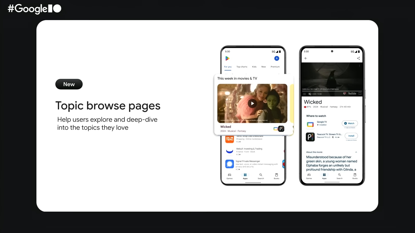
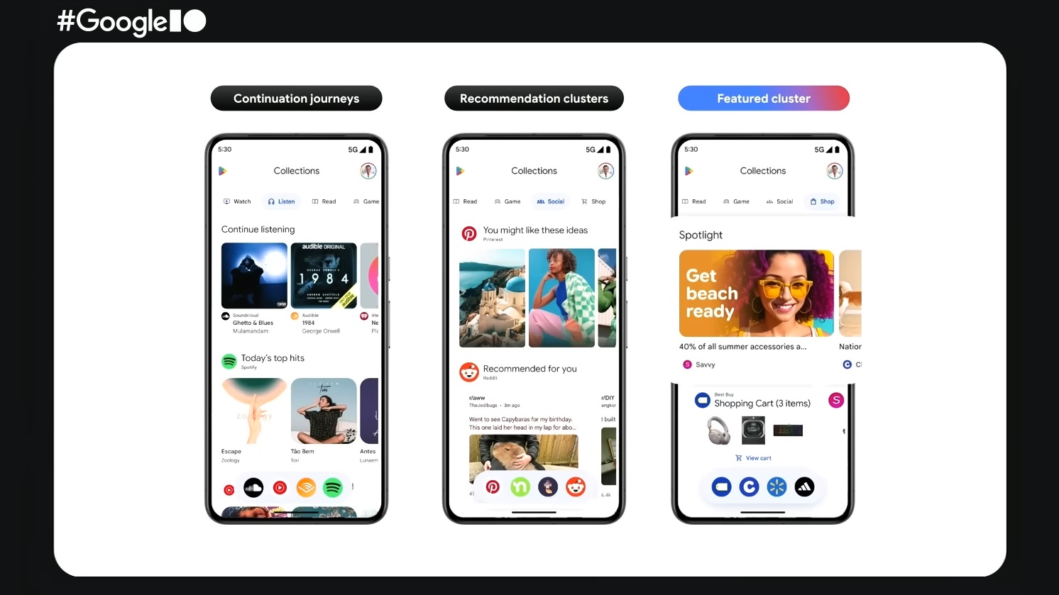
At the Google I/O 2025 event, the search giant presented some actual screenshots to showcase the changes in the new Play Store UI. This gives us our first look at what it might look like when it is released to the public. Google wants to make the Play Store something fun to explore instead of just a tool to download apps.
The first thing that jumps out is how organized the new home screen of the Apps section looks. The old UI looked a bit too cluttered and caused an information overdose, so I almost always went to the search instead of trying to interact with the apps showcased in the Apps section. However, the new home screen UI looks like something we can actually use. Also, Google added some video/image feeds for some apps on the home screen that showcase the best of what it has to offer.
The video feed appears edge-to-edge and looks quite appealing. This would probably help increase the app’s downloads. The “Happening Now” banner in one of the images that Google showed off, and its purpose is to showcase what music apps like YouTube Music can offer users.
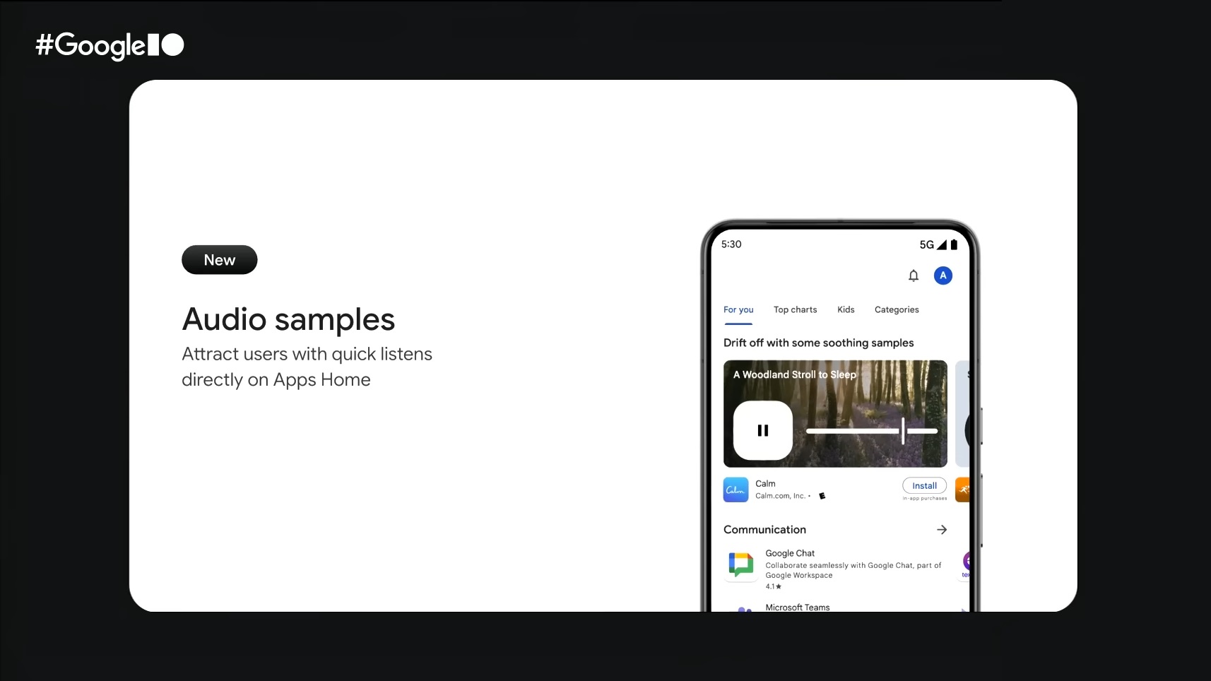
Also, the search results may include audio samples, which are probably designed to help make the app’s listing in the search results more interesting. Nonetheless, I believe this is just a glimpse of what Google is cooking. There could be more changes when it is released to the public later.
When Will the New Play Store UI Ship to Users?
Google didn’t share when the new Play Store UI would ship to users. However, given the fact that Google will be shipping the Material 3 Expressive redesign to Android 16 sometime in the second half of 2025, I believe this is when the new Play Store UI will actually ship.
We provide the latest news and “How To’s” for Tech content. Meanwhile, you can check out the following articles related to PC GPUs, CPU and GPU comparisons, mobile phones, and more:
- 5 Best Air Coolers for CPUs in 2025
- ASUS TUF Gaming F16 Release Date, Specifications, Price, and More
- iPhone 16e vs iPhone SE (3rd Gen): Which One To Buy in 2025?
- Powerbeats Pro 2 vs AirPods Pro 2: Which One To Get in 2025
- RTX 5070 Ti vs. RTX 4070 Super: Specs, Price and More Compared
- Windows 11: How To Disable Lock Screen Widgets